'en_US.UTF-8/en_US.UTF-8/en_US.UTF-8/C/en_US.UTF-8/C'
Correlation/Simple Regression
Applied Multiple Regression/Correlation Analysis for the Behavioral Sciences by Jacob Cohen, Patricia Cohen, Stephen G. West, Leona S. Aiken
통계에서 데이터의 타입은 대략 다음과 같이 나누어짐
- continuous / discrete
- quantitative / qualitative
- categorical unordered (nominal) / categorical ordered (ordinal)
- 성별, 지역 / 등급, 랭킹
- ordinal: 등간격을 가정
- 퀄리티 good, fair, poor는 등간격이라고 봐야하는가?
- 랭킹은?
- 선호도 1, 2, …, 8; continuous?
- 임금 구간?
- ratio, interval을 나누기도 함
- 0이 실제 의미있는 값일 때, 비율에 대해 말할 수 있음
- 무게가 2배 더 나간다.
- 날씨가 2배 더 덥다?
Correlation
A measure of association; 상관관계
Pearson’s correlation coefficient: r
- Linear relationships; x와 y의 선형적 연관성; 범위 [-1, 1]
- x로부터 y를 얼마나 정확히 예측할 수 있는가? (선형관계로부터)
- x와 y의 정보는 얼마나 중복(redundant)되는가?
Multiple correlation coefficient: R
- Extented correlation: 예측치와 관측치의 pearson’s correlation
- 자연에서 선형관계는 거의 관찰되지 않음
- 반대로, 사회과학의 지표들 사이에서는 대부분 대략적인 선형관계가 나타남
- 주요 예외로는 연령이 포함하는 관계: 나이에 따른 기억력 감퇴
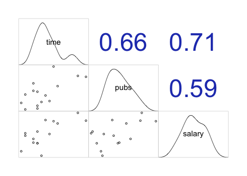
Linear correlation의 계산
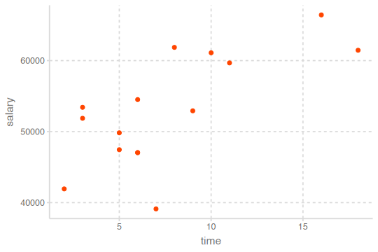
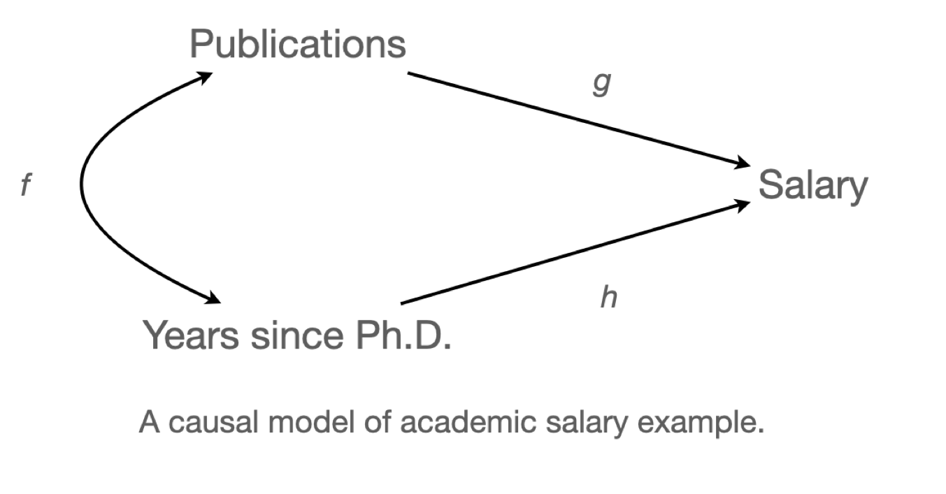
교수의 연봉(salary), 학위를 받은 후 지난 시간(time since Ph.D.), 출판물의 수(pubs)의 관계
Data: c0301dt.csv
acad0 <- read_csv("data/c0301dt.csv")
acad0 |> print()
# A tibble: 15 × 3
time pubs salary
<dbl> <dbl> <dbl>
1 3 18 51876
2 6 3 54511
3 3 2 53425
4 8 17 61863
5 9 11 52926
6 6 6 47034
7 16 38 66432
8 10 48 61100
9 2 9 41934
10 5 22 47454
11 5 30 49832
12 6 21 47047
13 7 10 39115
14 11 27 59677
15 18 37 61458The formula for Pearson’s correlation coefficient; the product moment correlation coefficient
\(X, Y\)에 대한 standardize (Z score); \(\displaystyle z_X = \frac{X-M_X}{sd_X}, \thinspace z_Y = \frac{Y-M_Y}{sd_Y}\)
\(r_{XY} = \displaystyle 1 - \frac{\sum{(z_X - z_Y)^2}}{2n}\) \(z_X, z_Y\) : 각각 standardized \(X, Y\)
\(r_{XY} = \displaystyle\frac{\sum_{i=1}^{n}{(x_i - \bar x)(y_i - \bar y)}}{\sqrt{\sum_{i=1}^{n}{(x_i - \bar x)^2}} \sqrt{\sum_{i=1}^{n}{(y_i - \bar y)^2}}}\) \(\bar x : X\) 의 평균, \(\bar y :Y\) 의 평균
df <- acad0 |>
  mutate(
    z_time = (time - mean(time)) / sd(time),
    z_pubs = (pubs - mean(pubs)) / sd(pubs),
    diff = z_time - z_pubs,
    squared = diff^2
  ) |>
  print()
# A tibble: 15 x 7
time pubs salary z_time z_pubs diff squared
<dbl> <dbl> <dbl> <dbl> <dbl> <dbl> <dbl>
1 3 18 51876 -1.02 -0.140 -0.880 0.774
2 6 3 54511 -0.364 -1.23 0.861 0.741
3 3 2 53425 -1.02 -1.30 0.278 0.0772
4 8 17 61863 0.0728 -0.212 0.285 0.0812
5 9 11 52926 0.291 -0.646 0.938 0.879
6 6 6 47034 -0.364 -1.01 0.644 0.415
7 16 38 66432 1.82 1.31 0.514 0.264
8 10 48 61100 0.510 2.03 -1.52 2.31
9 2 9 41934 -1.24 -0.791 -0.447 0.200
10 5 22 47454 -0.583 0.150 -0.732 0.536
11 5 30 49832 -0.583 0.728 -1.31 1.72
12 6 21 47047 -0.364 0.0772 -0.441 0.195
13 7 10 39115 -0.146 -0.719 0.573 0.328
14 11 27 59677 0.728 0.511 0.217 0.0471
15 18 37 61458 2.26 1.23 1.02 1.05 print(1 - sum(df$squared) / (2 * 14))[1] 0.6566546cor(acad0) |>
round(2) |> # 반올림 함수
print() time pubs salary
time 1.00 0.66 0.71
pubs 0.66 1.00 0.59
salary 0.71 0.59 1.00상관계수 크기에 대한 guidline
- \(| \thinspace r\thinspace|<0.3\): weak
- \(0.3\le|\thinspace r\thinspace|<0.5\): moderate
- \(|\thinspace r\thinspace|>0.5\) : strong relationship
상관계수를 제곱한 \(r^2\) 는 변량의 설명 정도를 나타내주는 계수; 결정계수 (\(R^2\), \(R\) squared)
이는 좀 더 해석가능한 값이 되고, strength of association를 나타내는 주요한 지표임.
뒤에서 자세히 다룸.
corrr 패키지의 correlate() 함수를 사용: tibble로 반환
vignette 참고
vignette(topic = "using-corrr",
package = "corrr")library(corrr)
acad0 |>
correlate(quiet = T) |> # quiet = True: 간결한 output, 숫자형 변수만 선택됨
print()# A tibble: 3 x 4
term time pubs salary
<chr> <dbl> <dbl> <dbl>
1 time NA 0.657 0.710
2 pubs 0.657 NA 0.588
3 salary 0.710 0.588 NA
다른 패키지들
# Base R의 cor()의 옵션들
cor(acad0, use = "pairwise.complete.obs") # NA의 처리: pairwise deletion

# psych 패키지의 corr.test() 또는 lowerCor()이용
library(psych)
corTest(acad0) # NA를 pairwise deletion으로 처리해줌

## Correlation matrix
##        time pubs salary
## time   1.00 0.66   0.71
## pubs   0.66 1.00   0.59
## salary 0.71 0.59   1.00

## Sample Size
## [1] 15
## Probability values (Entries above the diagonal are adjusted for multiple tests.)
##        time pubs salary
## time   0.00 0.02   0.01
## pubs   0.01 0.00   0.02
## salary 0.00 0.02   0.00
##
##  To see confidence intervals of the correlations, print with the short=FALSE option

lowerCor(acad0)
##        time pubs salary
## time   1.00
## pubs   0.66 1.00
## salary 0.71 0.59   1.00
시각화를 통한 상관계수
corrgram(), ggpairs()
library(corrgram)
corrgram(acad0,
  order = TRUE, # 상관계수가 높은 변수들을 가까이 위치시킴
  upper.panel = panel.cor, # 상관계수
  lower.panel = panel.pie, # 파이 차트
)
tip: use a function
corgrm <- function(df, order = TRUE){
    corrgram(df,
         order = order,  # 상관계수가 높은 변수들을 가까이 위치시킴
         upper.panel = panel.cor,   # 상관계수
         lower.panel = panel.pie,  # 파이 차트
    )
}

corgrm(acad0)
corgrm(acad0, order = FALSE)
Data from the 1985 Current Population Survey (CPS85)
임금, 교육수준, 연차, 나이, 성별 간의 상관관계
cps <- mosaicData::CPS85

cps |>
  select(wage, educ, exper, age, sex) |>
  mutate(sex = as.numeric(sex)) |> # factor를 숫자로 변환: 1, 2, ...
  corrgram(
    order = TRUE,
    upper.panel = panel.cor,
    lower.panel = panel.pie,
  )
corrgram(acad0,
  order = FALSE,
  lower.panel = panel.pts,
  upper.panel = panel.cor,
  diag.panel = panel.density
)
# GGally 패키지의 ggpairs()
GGally::ggpairs(acad0)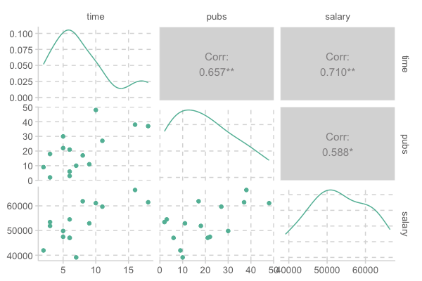
Tip: includes fitted lines
trendlines <- function(data, mapping, ...){
    ggplot(data = data, mapping = mapping) +
        geom_point(alpha = .6) +
        geom_smooth(method = loess, se = FALSE, color = "orange", ...) +
        geom_smooth(method = lm, se = FALSE, color = "skyblue", ...)
}

ggpairs(acad0, columns = 1:3, lower = list(continuous = trendlines))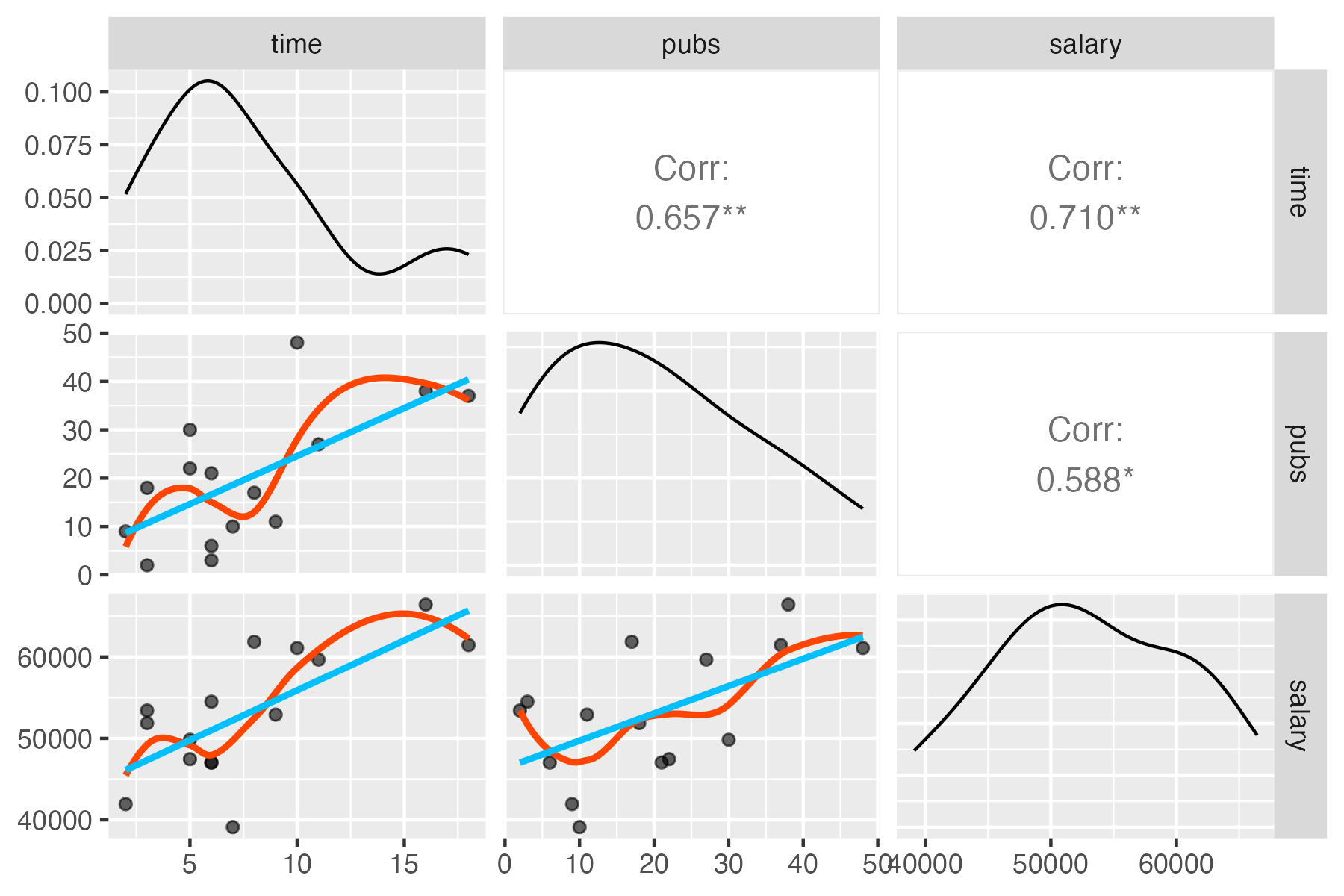
Note
명목변수인 경우에도 measure of association을 계산하는 방법이 있는데, 자세한 사항은 Measures of Association - How to Choose? 참고
R에서 계산은 correlation 함수에서 method 옵션이 있음: method를 “pearson”, “spearman”, “kendall” 중 선택
psych::corTest(df, method="")corrr::correlate(df, method="")
명목변수의 예
- 한 변수가 binary 인 경우: 물건의 가격 ~ 구매 여부
- 두 변수가 모두 binary 인 경우: 남녀 ~ 합격 여부
- 두 변수가 rank(ordinal) 인 경우: 다이아몬드 투명도(clarity)와 컬러(color)
binary인 경우: 0, 1로 코딩
rank인 경우: 1, 2, 3… 로 코딩
Regression
Simple linear/regression models
단순한 상관관계를 넘어서서,
Y가 X에 의해 영향을 받거나 X에 의해 예측되는 변수라는 연구자의 가정이 있음.
- Y: 종속변수 (dependent variable), regressand, outcome, response
- X: 독립변수 (independent variable), regressor, 예측변수 (predictor)
선형관계임을 가정하고, 데이터에 가장 근접한 직선을 구함
이상적으로, 모형(model)이 현상으로부터 노이즈가 제거된 진정한 신호를 잡아내 주기를 기대.
Linear model: \(y = ax + b + \epsilon\), \(\epsilon\): errors
이 직선을 주어진 데이터로부터 두 변수 간의 관계를 가장 잘 represent하는 model (모형)이라고 말함.
이는 확장된 의미에서 물리법칙에서 변수 간의 관계를 수학식으로 표현하고, 자연현상을 모델링한 것으로 이해할 수 있는 것과 같음.
Errors:
- Reducible error: 모형이 잡아내지 못한 신호; 영향을 미치지만 측정하지 않은 변수가 존재
- Irreducible error:
- 측정 오차 (measurement error): ex. 성별, 젠더, 키, 온도, 강수량, 지능, 불쾌지수, …
- random processes
- 물리적 세계의 불확실성: stochastic vs. deterministic world
- 물리적 세계의 불확실성: stochastic vs. deterministic world
- 보통 Gaussian/Normal 분포를 이루거나 가정:
예를 들어, 다음과 같이 x와 y의 관계가 나타난 경우,
- 패턴: 선형 관계
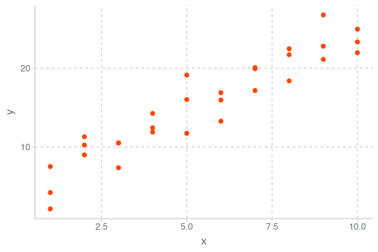
x와 y의 관계에 대한 모형을 세우는데, 모형은 두 부분으로 나눌 수 있음.
- A family of models를 정의: generic 패턴을 표현해 줄 수 있는 모델 타입. 예를 들어,
- 만약, 선형적인 관계라면 선형 모델인 \(y = a_2 x + a_1\)
- 곡선 관계라면 가령, \(y = a_3 x^2 + a_2 x + a_1\)
\(a_1, a_2, a_3\)는 패턴을 잡아 낼수 있도록 변하는 파라미터
- A fitted model을 생성: 데이터에 가장 가까운(적합한) 파라미터에 해당하는 특정 모델을 선택;
”fit a model to data”. 예를 들어,- \(y = 3x+7\)
- \(y = 2x^2 - 4x + 1\)
A fitted model은 a family of models 중에 데이터에 가장 가까운 모델임
- 이는 소위 “best” model일 뿐
- “good” model임을 뜻하지 않고, “true” model임을 뜻하는 것은 더더욱 아님
이제 위의 예를 보면, 선형성을 가정하고
- 선형 모델 family인 \(y = a_2 x + a_1\)을 세울 수 있음
- 무수히 많은 \(a_1, a_2\)의 값들 중 위 데이터에 가장 가까운 값을 찾음
- 이를 “fit a model to data”라고 하고, 그 특정 모델을 fitted model이라고 함
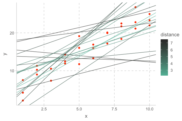
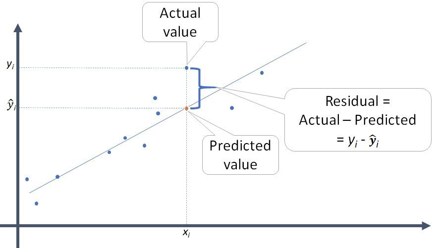
- 가깝다는 것을 정의하기 위해 데이터와 모델과의 거리를 정의해야 함; \(d =|~data - model~|\)
- 대표적으로 모델과 데이터의 수직 차이 (잔차; residuals)의 총체로 거리를 정의할 수 있음
- 최적의 모델은 이 거리를 최소로 함

Note
- 특히, 다음과 같은 RMSE (root-mean-square deviation)을 기본적인 거리로 정의하고
\(RMSE = \displaystyle\sqrt{\frac{1}{n} \sum_{i=1}^{n}{(Y_i -\hat Y_i)^2}},\) \(Y_i -\hat Y_i\) : residual (잔차)
- Mean absolute error: \(MAE = \displaystyle\frac{1}{n} \sum_{i=1}^{n}{|~Y_i -\hat Y_i~|}\)
- 이상치에 덜 민감함
이 거리를 이용해서 모델의 파라미터를 추정하는 것을 ordinary least square (OLS) esimate이라고 함
- 이 때, 잔차의 합은 0; \(\displaystyle \sum_{i=1}^{n}{(Y_i -\hat Y_i)} = 0\)
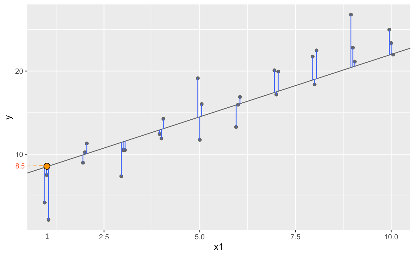
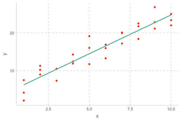
이제, 위 예제의 데이터와 꽤 가까운 임의의 20개의 선형 모델을 그려보면 다음과 같고, 이 중 거리가 최소인 모델이 fitted model이 됨
- 이 때, fitted model의 기울기는 2.05, y절편은 4.22임
R은 여러 형태의 a family of models을 구성할 수 있는 효율적인 툴을 제공
- Linear (regression) models: \(Y = a_0 + a_1 X_1 + a_2 X_2 + ~... ~ + a_n X_n\)
앞의 예는 \(n=1\) 에 해당하며, \(Y =a_0 +a_1X_1\)에 대해서 다음과 같이 편리하게 적용할 수 있음
sim1_mod <- lm(y ~ x, data = sim1) coef(sim1_mod) # 모델의 parameter 즉, coefficients를 내줌 #> (Intercept) x #> 4.220822 2.051533 # 위에서 구한 파라미터값과 동일함- 즉, 앞의 데이터에 최적인 선형 모형은 \(Y = 4.22 + 2.05X\)
lm()은 formulay ~ x를 \(Y =a_0 +a_1X\) 로 변환해 줌; Y 절편은 formula에서 생략- OLS estimation인 경우 알고리즘적이 아닌, 방정식의 해를 구하듯 exact form으로 최소값을 구함
- 즉, 앞의 데이터에 최적인 선형 모형은 \(Y = 4.22 + 2.05X\)
\(n=2\) 인 경우인 두 변수 \(X_1\), \(X_2\)로 \(Y\)를 예측하는 경우,
lm(y ~ x1 + x2, data = df)
Note
This formula notation is called “Wilkinson-Rogers notation”, and was initially described in Symbolic Description of Factorial Models for Analysis of Variance by G. N. Wilkinson and C. E. Rogers
위에서 y ~ x라는 formula는 x, y라는 변수를 바로 evaluate하지 않고, \(Y = a_0 + a_1X\)로 해석되어 함수로 전환됨
Visualising models
Fitted models을 이해하기 위해 모델이 예측하는 부분(prediction)과 모델이 놓친 부분(residuals)을 시각화해서 보는 것이 유용함
- Predictions: the pattern that the model has captured
- Residuals: what the model has missed; 통계 분석의 핵심 요소
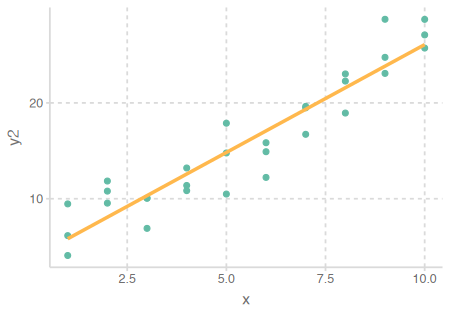
- 앞서 구한 모형 \(Y = 4.22 + 2.05X\) 을 데이터와 함께 그려보면,
이 모형에 의한 예측값들(pred)과 잔차(resid)들은
# A tibble: 30 x 4
x y pred resid
<int> <dbl> <dbl> <dbl>
1 1 4.20 6.27 -2.07
2 1 7.51 6.27 1.24
3 1 2.13 6.27 -4.15
4 2 8.99 8.32 0.665
5 2 10.2 8.32 1.92
6 2 11.3 8.32 2.97
7 3 7.36 10.4 -3.02
8 3 10.5 10.4 0.130
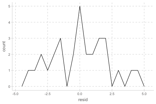
# i 22 more rowsResiduals의 분포를 시각화해서 살펴보면,
- residuals의 평균은 항상 0
- residuals의 분포는 predictions이 관측치로부터 전반적으로 얼마나 벗어났는지에 평가할 수 있음
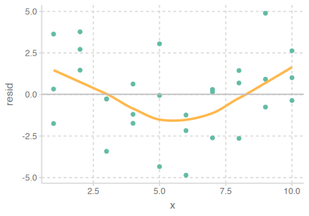
예측 변수와 residuals의 관계를 시각화해서 보면,
- 이 residuals은 특별한 패턴을 보이지 않아야 모델이 데이터의 패턴을 잘 잡아낸 것으로 판단할 수 있음
- 또한 어떤 부분에서 예측이 벗어났는지도 판별할 수 있음
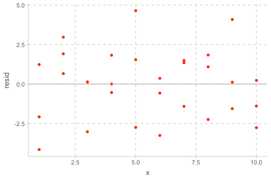
- Residuals에 패턴이 보이는 경우: 모형을 수정!
Case 1
교수의 연봉(salary)이 학위를 받은 후 지난 시간(time since Ph.D.)과 출판물의 수(pubs)에 의해 어떻게 영향을 받는가?
# A tibble: 15 x 3
   time  pubs salary
  <dbl> <dbl>  <dbl>
1     3    18  51876
2     6     3  54511
3     3     2  53425
4     8    17  61863
5     9    11  52926
6     6     6  47034
# i 9 more rows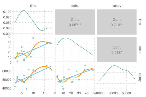
모형 세우기
선형모형: lm(y ~ x)
- \(\hat{Y} = a_0 + a_1X\), (\(\hat{Y}\): 예측치)
- 또는 \(Y = a_0 + a_1X +e\), (\(Y\): 관측치, \(e\): 잔차, 에러)
- \(a_1\): 기울기 (\(X\)가 1 증가할 때, \(Y\)의 증가량), \(a_0\): 절편 (\(X\)가 0일 때, \(Y\)의 값)
mod1 <- lm(salary ~ time, data = acad0): \(\widehat{salary} = a_0 + a_1time\)
mod2 <- lm(salary ~ pubs, data = acad0): \(\widehat{salary} = a_0 + a_1pubs\)
Fit a model to data
데이터에 가장 근접한 모델
mod1 <- lm(salary ~ time, data = acad0)
mod2 <- lm(salary ~ pubs, data = acad0)

coef(mod1)
## (Intercept)        time
##   43658.594    1224.392
coef(mod2)
## (Intercept)        pubs
##   46357.449     335.526
Model 1: \(\widehat{salary} = \$43,659 + \$1,224\:time\)
\(a_1\): 학위를 받은 후 1년이 지날 때마다, 연봉은 $1,224 오름 (표현에 주의!)
\(a_0\): 학위를 받은 후 0년일 때, 연봉은 $43,658; 0년이 의미있는가?Model 2 : \(\widehat{salary} = \$46,357 + \$336\:pubs\)
\(a_1\): 출판물 1편을 추가로 발표하면, 연봉은 $336 오름 (표현에 주의!)
\(a_0\): 출판물이 0편일 때, 연봉은 $46,357
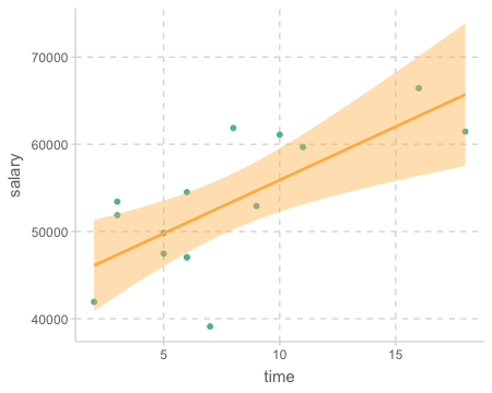
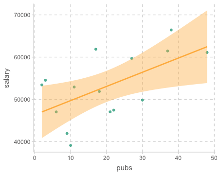
연봉(salary)을 연차(time)로 예측하는 모델(mod1)에 대해서 prediction과 residuals 값을 구해보면
단, 간편한 계산을 위해 salary를 1000으로 나누었으며, 51.876는 $51,876을 의미
- 아래 테이블에서 가령, 6년차인 교수의 연봉은 모형에 의해 $51,000로 예측되고,
- 2번째 교수의 경우 그 예측이 $3,510 정도 낮게 예측되었으며,
- 6번째 교수의 경우는 $3,9700 정도 높게 예측되었음
- 예측이 틀린 정도, 즉 잔차는 왜 생기는가? …
Important
모형의 분석은 예측/설명되는 부분과 예측/설명되지 않는 부분으로 쪼개어 보는 것이 기본적인 시각
예들 들어, 연차로 연봉을 설명할 수는 있는 부분 vs. 연차로 연봉이 설명되지 않는 부분!
code
library(modelr)
df <- acad0 |>
  mutate(salary = salary / 1000)

mod1 <- lm(salary ~ time, data = df)

df |>
  add_predictions(mod1) |>
  add_residuals(mod1) |>
  mutate("(pred-m)^2" = (pred - mean(pred))^2, "resid^2" = (resid)^2, "(salary-m)^2" = (salary - mean(salary))^2)
time salary pred resid (pred-m)^2 resid^2 (salary-m)^2
1 3 51.88 47.33 4.54 32.65 20.65 1.37
2 6 54.51 51.00 3.51 4.16 12.29 2.15
3 3 53.42 47.33 6.09 32.65 37.13 0.14
4 8 61.86 53.45 8.41 0.17 70.72 77.75
5 9 52.93 54.68 -1.75 2.67 3.07 0.01
6 6 47.03 51.00 -3.97 4.16 15.77 36.14
7 16 66.43 63.25 3.18 104.11 10.13 179.20
8 10 61.10 55.90 5.20 8.16 27.01 64.87
9 2 41.93 46.11 -4.17 48.14 17.42 123.47
10 5 47.45 49.78 -2.33 10.66 5.41 31.27
11 5 49.83 49.78 0.05 10.66 0.00 10.33
12 6 47.05 51.00 -3.96 4.16 15.67 35.98
13 7 39.12 52.23 -13.11 0.67 171.99 194.06
14 11 59.68 57.13 2.55 16.66 6.50 43.98
15 18 61.46 65.70 -4.24 160.07 17.97 70.77
graphical representation
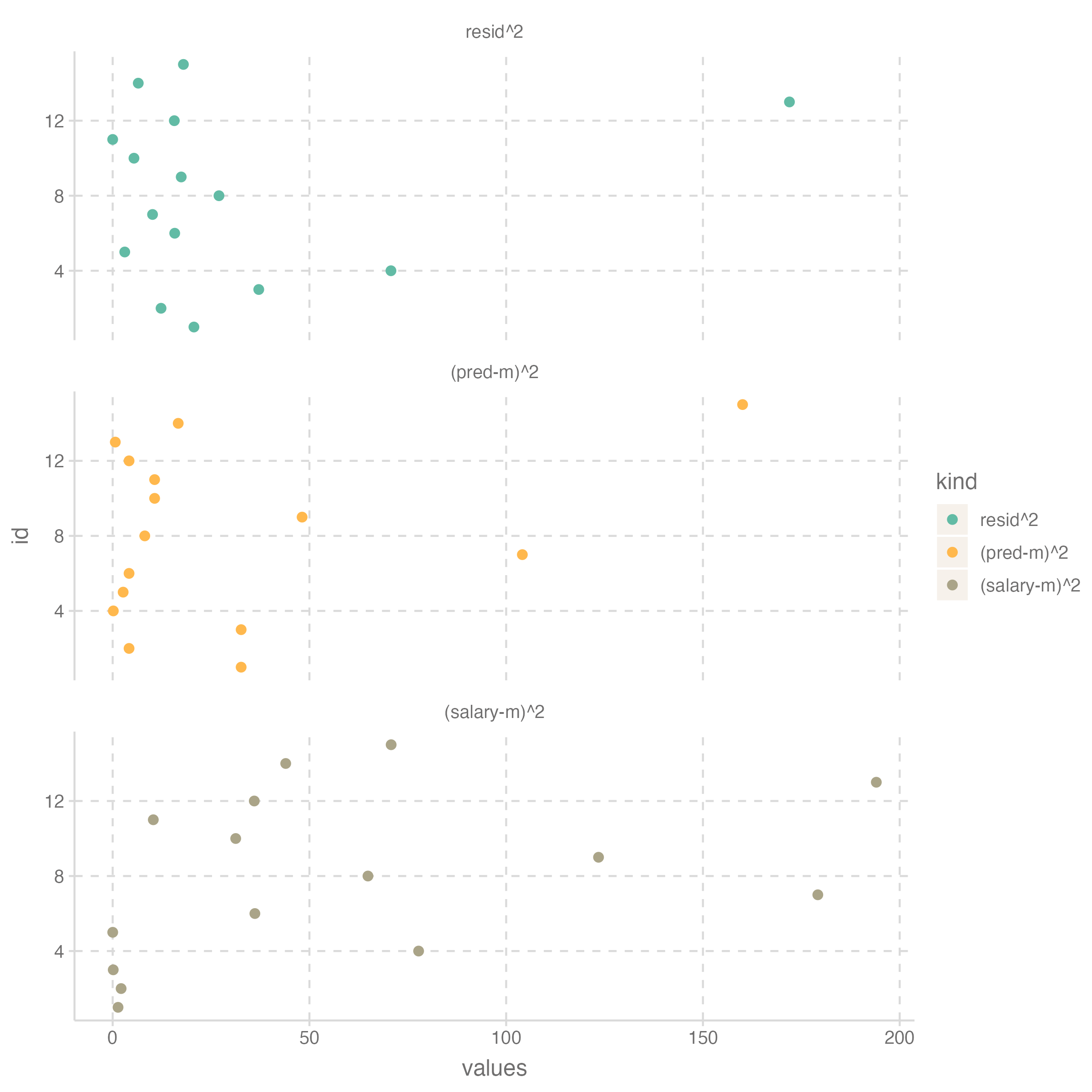
Column별로 더하면
  time salary   pred resid (pred-m)^2 resid^2 (salary-m)^2
1  115 795.68 795.68     0     439.75  431.73       871.48
우선, 연봉의 합 \(\sum{Y}\) = 예측값의 합 \(\sum{\hat{Y}}\) : \(X\) 의 평균은 모형에 의해 Y의 평균으로 예측됨
Important
Partitioning of variances
\(\sum{(\hat{Y}-m)^2}=439.75\) : 연차의 변량 (variation)으로 모형에 의해 설명되는 (attribute/acount for) 연봉의 변량
\(\sum{(Y-\hat{Y})^2}=431.73\) : 연차의 변량 (variation)으로 모형에 의해 설명될 수 없는 (not attribute) 연봉의 변량
\(\sum{(Y-m)^2}=871.48\) : 연봉의 변량
이 세 값의 관계는 \(\sum{(\hat{Y}-m)^2} + \sum{(Y-\hat{Y})^2} = \sum{(Y-m)^2}\)
- Sum of squares (SS)로 부르며,
- SSR, SSE, SSY (각각 sum of squares of Regression, Error, Y)
위 값을 다시 N(=15)으로 나누면, 즉 column별 평균은
  time salary  pred resid (pred-m)^2 resid^2 (salary-m)^2
1 7.67  53.05 53.05     0      29.32   28.78         58.1
위의 관계는 variance (분산)으로 보면,
\(V(predictions) + V(residuals) = V(Y)\)
이렇게 간결하게 쪼개지는 것은 predictions과 residuals이 서로 독립(\(r=0\))이 되기 때문으로 이해할 수 있음
- predictions \(\hat{Y}\) 은 \(X\) 의 일차 함수식으로 얻어진 것이므로 \(cor(X, \hat Y)=1\)이 되고,
- residuals \(Y-\hat{Y}\) 과 \(X\)는 상관이 없도록 estimate되었음.
# correlations with residuals
#         pred time salary
# resid  0.00 0.00  0.704
# salary 0.71 0.71  1.000
다시 위의 식에서 \(V(Y)\) 로 양변을 나누면
\(\displaystyle\frac{V(predictions)}{V(Y)} + \frac{V(residuals)}{V(Y)} = 1\)
Important
즉, “모형에 의해 설명되는 \(Y\) 변량의 비율” + “모형에 의해 설명되지 않는 \(Y\) 변량의 비율” = 1
첫 항을 \(R^2\) 라고 하고, 결정계수 혹은 R squared라고 부름
따라서, \(1-R^2\) 는 설명되지 않는 변량의 비율이라고 할 수 있음
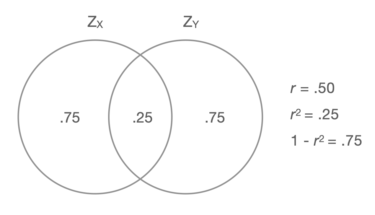
\(R^2\) 를 제곱근하면 \(R\) 이 나오고, 이는 Pearson’s correlation coefficient와 동일함;
- \(R(=r) = cor(Y, X) = cor(Y, \hat{Y}=aX+b)\)
- 기울기 \(\displaystyle a = r_{XY} \frac{sd_Y}{sd_X}\)
- \(R\) 은 예측의 정확성에 대한 지표라고 이해할 수 있음
Overlap in variance of correlated variables
ANOVA
모형 자체에 대한 분석으로 ANOVA 결과는 anova()함수를 써서 볼 수 있음
모집단에 대한 추론: 모형의 설명력이 모집단에서 0은 아닐 것이라는 추론;
- Null 모형 대비 주어진 모형이 잔차를 얼마나 줄였는가를 테스트함으로써 주어진 모형의 설명력이 0은 아님을 보임
- Null 모형:
y ~ 1(예측변수가 없는 모형, 설명력 0)
- Null 모형:
- 잔차 변량(SSE) 대비 예측 변량(SSR)이 얼마나 큰가를 F분포를 이용해 통계적 추론이 이루어짐
- [주어진 모형의 잔차 변량 (SSE)] - [null 모형의 잔차 변량] = SSE - SSY = SSR
- 즉, 추가된 예측 변수에 의해 설명되는 변량 정도가 sampling error, 즉 표본 추출에 따른 우연성에 의해 나타날 수 있을 확률을 계산
anova(mod1)
# Analysis of Variance Table

# Response: salary
#           Df Sum Sq Mean Sq F value Pr(>F)
# time       1 439.75  439.75  13.241  0.003 **
# Residuals 13 431.73   33.21
# ---
# Signif. codes: 0 ‘***’ 0.001 ‘**’ 0.01 ‘*’ 0.05 ‘.’ 0.1 ‘ ’ 1- 대략, (예측변수로 설명되지 않는 Y인) 잔차의 평균 변량: \(\sqrt{mean~of~SSE} = \sqrt{33.21} = 5.763\)
- 대략 말하면, 모형이 예측한 연봉과 실제 연봉의 차이는 평균 $5,763 정도 된다는 것을 의미함
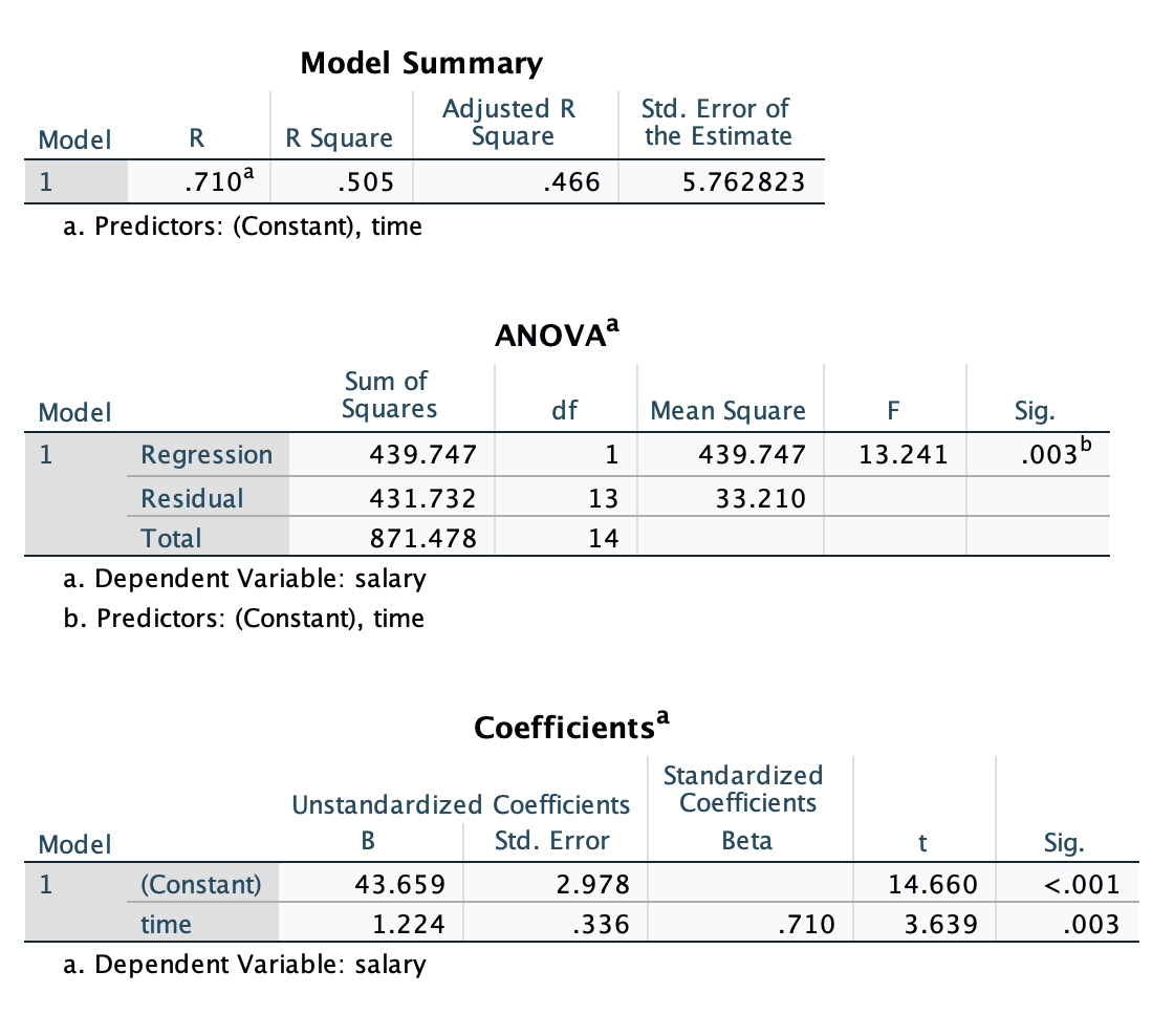
모형 \(\widehat{salary} = a_0 + a_1time\) 에 대한
SPSS 결과 테이블:
df <- acad0 |>
  mutate(salary = salary / 1000)
mod1 <- lm(salary ~ time, data = df)
summary(mod1)
Call:
lm(formula = salary ~ time, data = df)

Residuals:
     Min       1Q   Median       3Q      Max
-13.1143  -3.9644   0.0514   4.0251   8.4093

Coefficients:
            Estimate Std. Error t value Pr(>|t|)
(Intercept)  43.6586     2.9780  14.660 1.83e-09 ***
time          1.2244     0.3365   3.639    0.003 **
---
Signif. codes:  0 '***' 0.001 '**' 0.01 '*' 0.05 '.' 0.1 ' ' 1

Residual standard error: 5.763 on 13 degrees of freedom
Multiple R-squared:  0.5046,    Adjusted R-squared:  0.4665
F-statistic: 13.24 on 1 and 13 DF,  p-value: 0.003
Important
\(R^2\) 는 모형이 predictor들로부터 Y의 변량을 얼마나 예측/설명해주는지에 대한 지표로서 가장 널리 쓰임.
다음의 두 경우는 1년의 연차가 $1,224의 연봉 증가로 나타나는 동일한 관계를 보여주지만, 그 strength of association에는 큰 차이가 있음
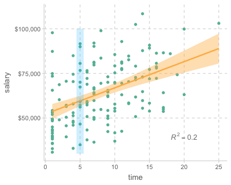
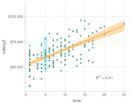
Exercises
출판물의 수(pubs)가 연봉(salary)에 어떻게 영향을 미치는지 살펴보세요.
Case 2
다음 데이터는 the Octogenarian Twin Study of Aging에서 나타나는 패턴을 기반으로 생성한 데이터
출처: Longitudinal Analysis: Modeling Within-Person Fluctuation and Change by Lesa Hoffman
includes 550 older adults age 80 to 97 years.
Cognition was assessed by the Information Test, a measure of general world knowledge (i.e., crystallized intelligence; range = 0 to 44)
demgroup 1: those who will not be diagnosed with dementia (none group = 1; 72.55%),
demgroup 2: those who will eventually be diagnosed with dementia later in the study (future group = 2; 19.82%)
demgroup 3: those who already have been diagnosed with dementia (current group = 3; 7.64%)
cognition <- read_csv("data/spss_chapter2.csv")
cognition |> print()
# A tibble: 550 × 6
PersonID cognition age grip sexMW demgroup
<dbl> <dbl> <dbl> <dbl> <dbl> <dbl>
1 1 23 92.6 9 1 1
2 2 24 91.8 11 0 2
3 3 29 92.6 12 0 1
4 4 16 94.4 6 1 1
5 5 27 85.8 9 1 1
6 6 37 83.1 11 0 1
# ℹ 544 more rows
code for ggpairs
trendlines <- function(data, mapping, ...){
    ggplot(data = data, mapping = mapping) +
        geom_point(alpha = .6) +
        geom_smooth(method = loess, se = FALSE, color = "orange", ...) +
        geom_smooth(method = lm, se = FALSE, color = "skyblue", ...)
}

ggpairs2 <- function(data, ...) {
    GGally::ggpairs(data, lower = list(continuous = trendlines))
}

ggpairs2(cognition, columns = 2:6)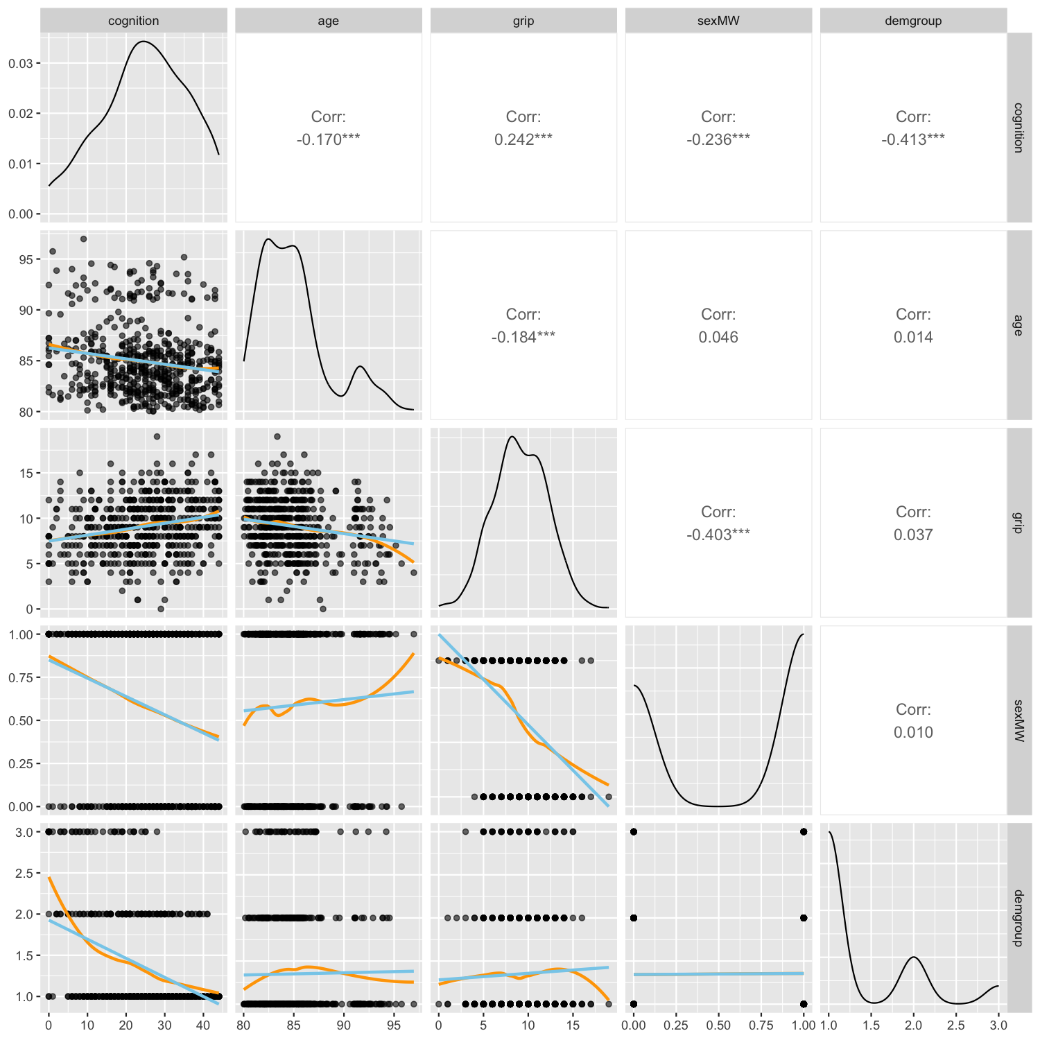
library(corrr)
correlate(cognition[-1], quiet = T) |> print()
# A tibble: 5 x 6
term cognition age grip sexMW demgroup
<chr> <dbl> <dbl> <dbl> <dbl> <dbl>
1 cognition NA -0.170 0.242 -0.236 -0.413
2 age -0.170 NA -0.184 0.0456 0.0144
3 grip 0.242 -0.184 NA -0.403 0.0368
4 sexMW -0.236 0.0456 -0.403 NA 0.00992
5 demgroup -0.413 0.0144 0.0368 0.00992 NA
Tip
cognition |>
    select(cognition, age, grip) |>
    corTest()
          cognition   age  grip
# cognition      1.00 -0.17  0.24
# age           -0.17  1.00 -0.18
# grip           0.24 -0.18  1.00

corTest(cognition["cognition"], cognition[c("age", "grip")])
# Correlation matrix
#             age grip
# cognition -0.17 0.24
cognition |>
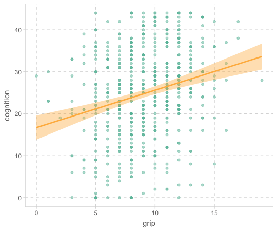
ggplot(aes(x = grip, y = cognition)) +
geom_point(alpha = .5) +
geom_smooth()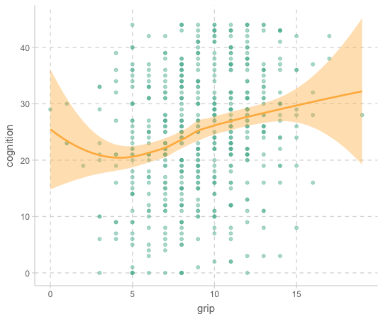
mod_cog <- lm(cognition ~ grip, data = cognition)
summary(mod_cog)
Call:
lm(formula = cognition ~ grip, data = cognition)

Residuals:
     Min       1Q   Median       3Q      Max
-27.3941  -7.1578   0.3877   8.8377  22.8422

Coefficients:
            Estimate Std. Error t value Pr(>|t|)
(Intercept)  16.7033     1.4640  11.409  < 2e-16 ***
grip          0.8909     0.1527   5.834 9.24e-09 ***
---
Signif. codes:  0 ‘***’ 0.001 ‘**’ 0.01 ‘*’ 0.05 ‘.’ 0.1 ‘ ’ 1

Residual standard error: 10.67 on 548 degrees of freedom
Multiple R-squared:  0.05848,   Adjusted R-squared:  0.05677
F-statistic: 34.04 on 1 and 548 DF, p-value: 9.244e-09- 기울기 0.89를 의미있게 해석할 수 있는가?
- 절편 16.7은?
- \(R^2\) = 0.058; 악력의 변량으로 인지능력 변량의 5.8%가 설명됨
summary() 대신 jtools 패키지의 summ()
library(jtools)
summ(mod_cog)

# MODEL INFO:
# Observations: 550
# Dependent Variable: cognition
# Type: OLS linear regression

# MODEL FIT:
# F(1,548) = 34.04, p = 0.00
# R² = 0.06
# Adj. R² = 0.06

# Standard errors:OLS
# ------------------------------------------------
#                      Est.   S.E.   t val.      p
# ----------------- ------- ------ -------- ------
# (Intercept)         16.70   1.46    11.41   0.00
# grip                 0.89   0.15     5.83   0.00
# ------------------------------------------------
변수의 표준화
standardize: \(\displaystyle z = \frac{x-m}{sd}; ~ax+b\)의 꼴 ; zoom + translate
- 변수를 표준화하면 평균이 0이고, 표준편차가 1로 변환
- 변수가 대략적으로 정규분포(normal distribution)을 따를 때,
- 내재적인 단위가 없는 측정치들의 경우 그 값을 표준화시키면 해석이 용이하며,
- 표준편차(sd)가 그 눈금/단위가 됨으로써 변수에 상관없이 동일한 눈금을 갖게 되어, 변수들 간의 비교가 가능해짐
- 즉, 표준화된 변수의 1은 1sd를 의미
- 또한, 평균이 0이 됨으로써 선형모형에서 용이한 trick을 제공해 줌
- 변수를 표준화해도 사실상 중요한 통계치는 변화하지 않음; 상관계수, \(R^2\), \(p\) value 등
- 좀 더 일반적으로 linear transform(\(y=ax+b\))에 의해서 변하지 않음; 온도 C/F
- 반면, 주어진 샘플의 평균과 표준편차를 사용함으로 샘플마다 변동이 생길 수 있음을 인지해야 함.
cognition <- cognition |>
  select(cog_std = cognition, grip_std = grip) |>
  scale() |> # standardize 함수
  bind_cols(cognition) # column bind: 열 방향으로 두 데이터프레임을 붙힘

cognition |> print()
# A tibble: 550 × 8
cog_std grip_std PersonID cognition age grip sexMW demgroup
<dbl> <dbl> <dbl> <dbl> <dbl> <dbl> <dbl> <dbl>
1 -0.166 -0.0378 1 23 92.6 9 1 1
2 -0.0748 0.633 2 24 91.8 11 0 2
3 0.380 0.968 3 29 92.6 12 0 1
4 -0.803 -1.04 4 16 94.4 6 1 1
5 0.198 -0.0378 5 27 85.8 9 1 1
6 1.11 0.633 6 37 83.1 11 0 1
# ℹ 544 more rows
jtools 패키지의
standardize() 함수를 이용한 표준화
cognition |>
  jtools::standardize(c("cogition", "grip"))
cognition |>
ggplot(aes(x = grip_std, y = cog_std)) +
geom_point(alpha = .5) +
geom_smooth(method = lm)
cognition |>
ggplot(aes(x = grip, y = cognition)) +
geom_point(alpha = .5) +
geom_smooth(method = lm)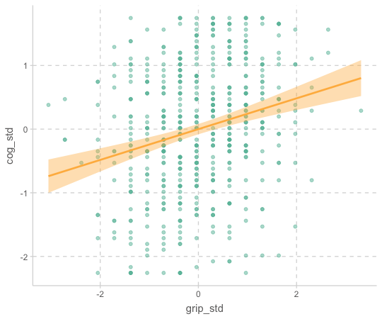
library(ggpubr)
cognition |>
  ggplot(aes(x = cognition, y = after_stat(density))) +
  geom_freqpoly(binwidth = 2) +
  stat_overlay_normal_density(color = "red")

cognition |>
  ggplot(aes(x = grip, y = after_stat(density))) +
  geom_freqpoly(binwidth = 1) +
  stat_overlay_normal_density(color = "red")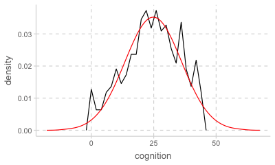
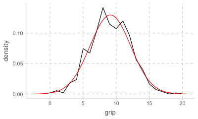
Normal distribution 정규 분포; 사실상 sd만으로 결정되는 분포 곡선
Source: The Truthful Art by Albert Cairo
mod_cog_std <- lm(cog_std ~ grip_std, data = cognition)
summary(mod_cog_std) |> print(digits = 2)
Call:
lm(formula = cog_std ~ grip_std, data = cognition)

Residuals:
   Min     1Q Median     3Q    Max
-2.493 -0.651  0.035  0.804  2.079

Coefficients:
            Estimate Std. Error t value Pr(>|t|)
(Intercept)  1.2e-16    4.1e-02     0.0        1
grip_std     2.4e-01    4.1e-02     5.8    9e-09 ***
---
Signif. codes:  0 '***' 0.001 '**' 0.01 '*' 0.05 '.' 0.1 ' ' 1

Residual standard error: 0.97 on 548 degrees of freedom
Multiple R-squared:  0.058, Adjusted R-squared:  0.057
F-statistic:  34 on 1 and 548 DF,  p-value: 9.2e-09
- \(R^2\) 와 p values는 변함이 없으며, y intercept (y 절편)은 0
- 기울기 0.24는 두 변수 간의 Pearson’s 상관계수와 같음
Tip:
summ(df, scale = TRUE, transform.response = TRUE)
library(jtools)

# scale: predictors 표준화, transform.response: response 표준화
summ(mod_cog_std, scale = TRUE, transform.response = TRUE)  # digits = 3, center = TRUE

# ------------------------------------------------
#                      Est.   S.E.   t val.      p
# ----------------- ------- ------ -------- ------
# (Intercept)         -0.00   0.04    -0.00   1.00
# grip_std             0.24   0.04     5.83   0.00
# ------------------------------------------------

# Continuous variables are mean-centered and scaled by 1 s.d.
Case 3
성별에 따라 인지능력(cognition)에 차이가 있는가?
성별에 따라 악력(grip)에 차이가 있는가?
cognition <- cognition |>
  mutate(sex = factor(sexMW, levels = c(0, 1), labels = c("male", "female")))
cognition |> print()
# A tibble: 550 × 9
cog_std grip_std PersonID cognition age grip sexMW demgroup sex
<dbl> <dbl> <dbl> <dbl> <dbl> <dbl> <dbl> <dbl> <fct>
1 -0.166 -0.0378 1 23 92.6 9 1 1 female
2 -0.0748 0.633 2 24 91.8 11 0 2 male
3 0.380 0.968 3 29 92.6 12 0 1 male
4 -0.803 -1.04 4 16 94.4 6 1 1 female
5 0.198 -0.0378 5 27 85.8 9 1 1 female
6 1.11 0.633 6 37 83.1 11 0 1 male
# ℹ 544 more rowsCode
p1 <- cognition |>
  ggplot(aes(x = sex, y = cognition)) +
  geom_jitter(width = .1, alpha = .3, size = 2) +
  stat_summary(fun = mean, geom = "point", size = 3, fill = "red") +
  labs(title = "Cognition predicted by sex")

p2 <- cognition |>
  ggplot(aes(x = sex, y = cognition)) +
  geom_boxplot() +
  stat_summary(fun = mean, geom = "point", size = 3, fill = "red")

library(patchwork)
p1 + p2
Code
p1 <- cognition |>
  ggplot(aes(x = sex, y = grip)) +
  geom_jitter(width = .1, alpha = .3, size = 2) +
  stat_summary(fun = mean, geom = "point", color = "red", size = 3) +
  stat_summary(aes(x = as.numeric(sex)), fun = mean, geom = "line", fill = "red") +
  labs(title = "Grip predicted by sex")

p2 <- cognition |>
  ggplot(aes(x = sex, y = grip)) +
  geom_boxplot() +
  stat_summary(fun = mean, geom = "point", size = 3, fill = "red")

p3 <- cognition |>
  ggplot(aes(x = grip, color = sex)) +
  geom_density(alpha = .6, bw = 1.5)

library(patchwork)
p1 + p2 + p3 + plot_layout(nrow = 2)
성별(sex)로 악력(grip)을 예측하는 모형을 세우면,
library(jtools)
mod_grip <- lm(grip ~ sex, data = cognition)
summ(mod_grip, model.info = FALSE)
MODEL FIT: F(1,548) = 106.41, p = 0.00 R² = 0.16 Adj. R² = 0.16 Standard errors:OLS ------------------------------------------------ Est. S.E. t val. p ----------------- ------- ------ -------- ------ (Intercept) 10.55 0.18 58.16 0.00 sexfemale -2.44 0.24 -10.32 0.00 ------------------------------------------------
Model: \(\widehat{grip} = -2.44\cdot sexfemale + 10.55\)
우선, 잔차의 합이 0이므로 \(\displaystyle \sum_{i=1}^{n}{(y_i - \hat{y})} = 0,~~ \hat{y} = \frac{\sum_{i=1}^{n}{y_i}}{n}\) for each \(x\)
즉, 각 카테고리 값에 대해서 모형은 평균으로 예측
- 기울기 -2.44는 남성과 여성의 평균 악력 차이를 의미함; 남성(0)에서 여성(1)로 1증가할 때, 악력의 증가량
- 절편 10.55는 남성(0)일 때의 평균 악력을 의미함.
- 따라서, 여성의 평균 약력은 -2.44 * (1) + 10.55 = 8.11
- \(R^2\)= 0.16; 성별로 악력의 변량의 16%를 설명할 수 있음.
# A tibble: 550 x 5
    grip sex    sexfemale  pred  resid
   <dbl> <fct>      <dbl> <dbl>  <dbl>
 1     9 female         1  8.11  0.895
 2    11 male           0 10.5   0.454
 3    12 male           0 10.5   1.45
 4     6 female         1  8.11 -2.11
 5     9 female         1  8.11  0.895
 6    11 male           0 10.5   0.454
 7    10 female         1  8.11  1.89
 8     9 male           0 10.5  -1.55
 9    11 male           0 10.5   0.454
10    10 male           0 10.5  -0.546
# i 540 more rowsanova(mod_grip) |> print()Analysis of Variance Table
Response: grip
Df Sum Sq Mean Sq F value Pr(>F)
sex 1 794.3 794.33 106.41 < 2.2e-16 ***
Residuals 548 4090.7 7.46
---
Signif. codes: 0 '***' 0.001 '**' 0.01 '*' 0.05 '.' 0.1 ' ' 1
Dummmy coding
Formula는 factor/카테고리 변수가 predictor인 경우 카테고리 값(levels)들을 수치화해줌.
여러 방식이 있느나, 기본은 dummy coding으로, 각 카테고리를 0과 1로 표현하며, memership으로 이해하는 것이 적절함.
그 값을 새로운 변수인 dummy variable/indicator variable로 만드는데, 1에 해당하는 level을 변수명에 표시함.
예를 들어, 다음과 같이 female에 속하면(membership) 1, female에 속하지 않으면 0
library(modelr)
model_matrix(cognition, formula = grip ~ sex) |> print()
# # A tibble: 550 x 2
#   `(Intercept)` sexfemale
#           <dbl>     <dbl>
# 1             1         1
# 2             1         0
# 3             1         0
# 4             1         1
# 5             1         1
# 6             1         0
# # i 544 more rows
Coding을 어떠한 방식으로 하느냐에 따라 회귀 계수의 의미가 달라짐.
예를 들어, effect coding의 경우 (female: -1, male: 1)
contrasts(cognition$sex) <- contr.sum(2)\(\displaystyle b_0 = \frac{\overline{Y}_1 + \overline{Y}_2}{2},~~ b_1 = \overline{Y}_1 - \frac{\overline{Y}_1 + \overline{Y}_2}{2}\)
Sequential coding, Helmert coding, effect coding 등등 여러 다른 coding 방식에 대해서는 책을 참고.
10.1 Alternative Coding Systems in Regression Analysis and Linear Models by Richard B. Darlington & Andrew F. Hayes
두 집단 간 차이: t-test
전통적으로 카테고리 변수에 대한 분석은 ANOVA 프레임워크에서 실시되었음.
특히, 위의 경우와 같이 두 집단 간의 차이, 즉 남성과 여성의 약력의 평균 차이를 분석할 때 t-test를 실시.
t.test(grip ~ sex, data = cognition, var.equal = TRUE)  # varance가 동일하다는 가정

#   Two Sample t-test

# data:  grip by sex
# t = 10.316, df = 548, p-value < 2.2e-16
# alternative hypothesis: true difference in means between group male and group female is not equal to 0
# 95 percent confidence interval:
#  1.976174 2.905811
# sample estimates:
#   mean in group male mean in group female
#            10.546256             8.105263
Factor의 levels을 formula 안에서 간단히 변경하려면, fct_relevel()
mod_grip2 <- lm(grip ~ fct_relevel(sex, "female"), data = cognition)
# 또는 relevel(sex, ref = "female")

model_matrix(cognition, mod_grip2) |> print()
# A tibble: 550 × 2
`(Intercept)` `fct_relevel(sex, "female")male`
<dbl> <dbl>
1 1 0
2 1 1
3 1 1
4 1 0
5 1 0
6 1 1
# ℹ 544 more rowssumm(mod_grip2)MODEL INFO: Observations: 550 Dependent Variable: grip Type: OLS linear regression MODEL FIT: F(1,548) = 106.41, p = 0.00 R² = 0.16 Adj. R² = 0.16 Standard errors:OLS -------------------------------------------------- Est. S.E. t val. p -------------------- ------ ------ -------- ------ (Intercept) 8.11 0.15 53.32 0.00 fct_relevel(sex, 2.44 0.24 10.32 0.00 "female")male --------------------------------------------------
연습문제
1. 자존감과 자기통제력이 학업성취도에 미치는 영향
다음은 Multiple Regression and Beyond (3e) by Timothy Z. Keith의 p.87에서 제시된 경로모형입니다. 저자가 설정한 인과관계를 참고하여 데이터를 cleaning하고 변수들 간의 관계를 탐색해보세요.
데이터셋: NELS88 sample 5-9.csv
Figure 5.9에서는 자존감과 자기통제력이 학업성취도에 미치는 영향에 대해 설정한 관계를 보여줍니다. 
- Self-esteem과 locus of control에 대해서 composite score 만들고
- Sex 변수는 factor로 변환하여 male, female로 표시합니다.
- 사회경제적 지표에 대해서 어떤 방식으로 사용하는 것이 타당할지 고민해보세요.
- SES의 여러 변수들을 적절히 factor나 ordinal로 변환하거나
- prestige score값을 사용하거나,
- composite score인
byses를 사용
- 변수들 간의 관계를 탐색해보세요.
| 그림 변수명 | 데이터 변수명 | 설명 |
|---|---|---|
| Self-Esteem | 다음 진술에 대해 어떻게 느끼십니까? | |
| f1s62a | 나는 나 자신에 대해 좋게 느낀다 | |
| f1s62d | 나는 내가 가치 있는 사람이며, 다른 사람들과 동등하다고 느낀다 | |
| f1s62e | 나는 대부분의 다른 사람들만큼 일을 잘 할 수 있다 | |
| f1s62h | 전반적으로, 나는 나 자신에 대해 만족한다 | |
| f1s62i | 때때로 나는 쓸모없다고 느낀다 | |
| f1s62j | 때때로, 나는 내가 좋지 않다고 생각한다 | |
| f1s62l | 나는 자랑할 것이 많지 않다고 느낀다 | |
| Locus of Control | 다음 진술에 대해 어떻게 느끼십니까? | |
| f1s62b | 나는 내 삶의 방향에 대한 충분한 통제력이 없다 | |
| f1s62c | 내 삶에서, 성공을 위해 열심히 일하는 것보다 행운이 더 중요하다 | |
| f1s62f | 내가 앞으로 나아가려고 할 때마다, 무언가 또는 누군가가 나를 막는다 | |
| f1s62g | 내 계획은 거의 실현되지 않으므로, 계획을 세우는 것은 나를 불행하게 만들 뿐이다 | |
| f1s62k | 내가 계획을 세울 때, 나는 그것을 실현할 수 있다고 거의 확신한다 | |
| f1s62m | 우연과 행운은 내 삶에서 일어나는 일에 매우 중요하다 | |
| SES | ||
| byp30 | 귀하가 완료한 최고 교육 수준은 무엇입니까? | |
| byp31 | 귀하의 배우자/파트너가 완료한 최고 교육 수준은 무엇입니까? | |
| byp34b | 현재 직업 설명 | |
| byp34b_prest | byp34b의 각 직업에 대해 Duncan의 직업별 prestige 지표를 적용한 값 | |
| byp37b | 배우자의 현재 직업 설명 | |
| byp37b_prest | byp37b의 각 직업에 대해 Duncan의 직업별 prestige 지표를 적용한 값 | |
| byp80 | 1987년 모든 출처에서 가족의 총 수입은 얼마였습니까? (확실하지 않은 경우 추정해 주세요.) | |
| Achievement | f1txhstd | 10학년 역사, 공민학, 지리학(또는 사회 과목) 표준화 시험 점수 |
| Previous Grades | bygrads | 6-8학년 때의 평균 학점 |
| Sex | sex | 성별 |
| 그림 변수명 | 데이터 변수명 | 설명 |
|---|---|---|
| Self-Esteem | f1cncpt2 | 10학년 자존감 |
| Locus of Control | f1locus2 | 10학년 통제 위치 |
| SES | byses | 광범위한 사회경제적 지위(SES) |
2. 숙제가 학업성취에 미치는 영향
다음은 Multiple Regression and Beyond (3e) by Timothy Z. Keith의 p.69에서 제시된 경로모형입니다.
숙제(homework)가 학업성취도에 미치는 영향에 대해 설정한 관계를 보여줍니다.
변수들 간의 관계를 탐색해보세요.
데이터셋: NELS88 sample 4-11.csv
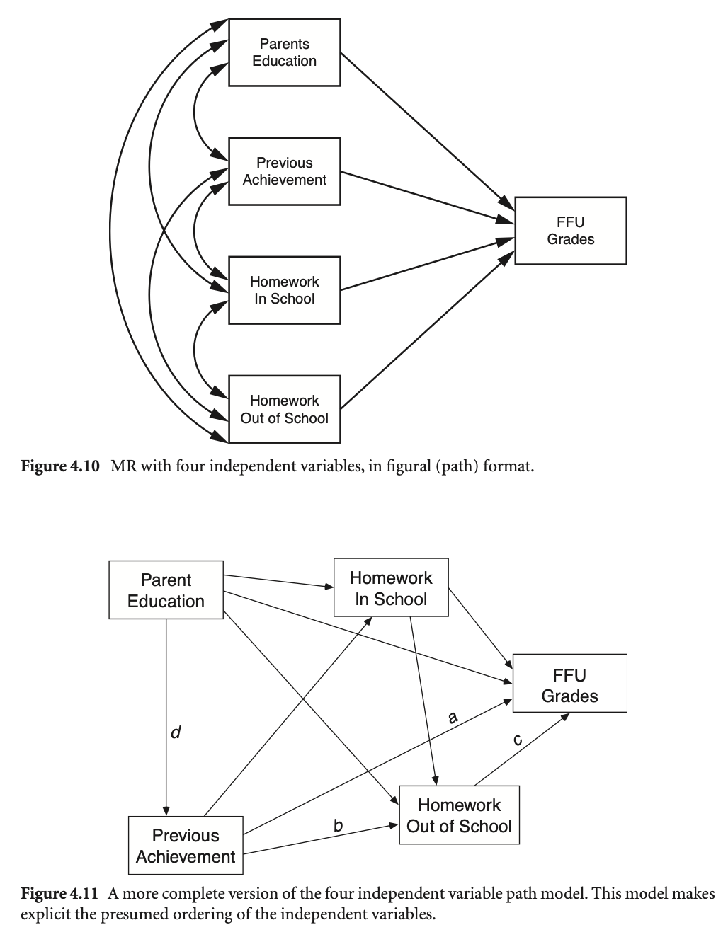
| 그림 변수명 | 데이터 변수명 | 설명 |
|---|---|---|
| FFU Grades | ffugrad | 10학년 학생들의 영어, 수학, 과학, 사회과목 평균 성적 |
| Parent Education | bypared | 학생 부모(부 또는 모 중 더 높은 쪽)의 교육 수준 |
| Homework in School | f1s36a1 | 10학년 학생들이 매주 평균적으로 학교에서 보내는 과제 시간 |
| Homework out of School | f1s36a2 | 10학년 학생들이 매주 평균적으로 학교 밖에서 보내는 과제 시간 |
| Previous Achievement | bytests | 8학년 성취도 시험 (평균) |